Prian
Prian.ru is a housing search service. Using special filters, the system will select the most affordable real estate option.
Client
Worldwide
Type
UI/UX Design
Year
2020

Process
The main issue
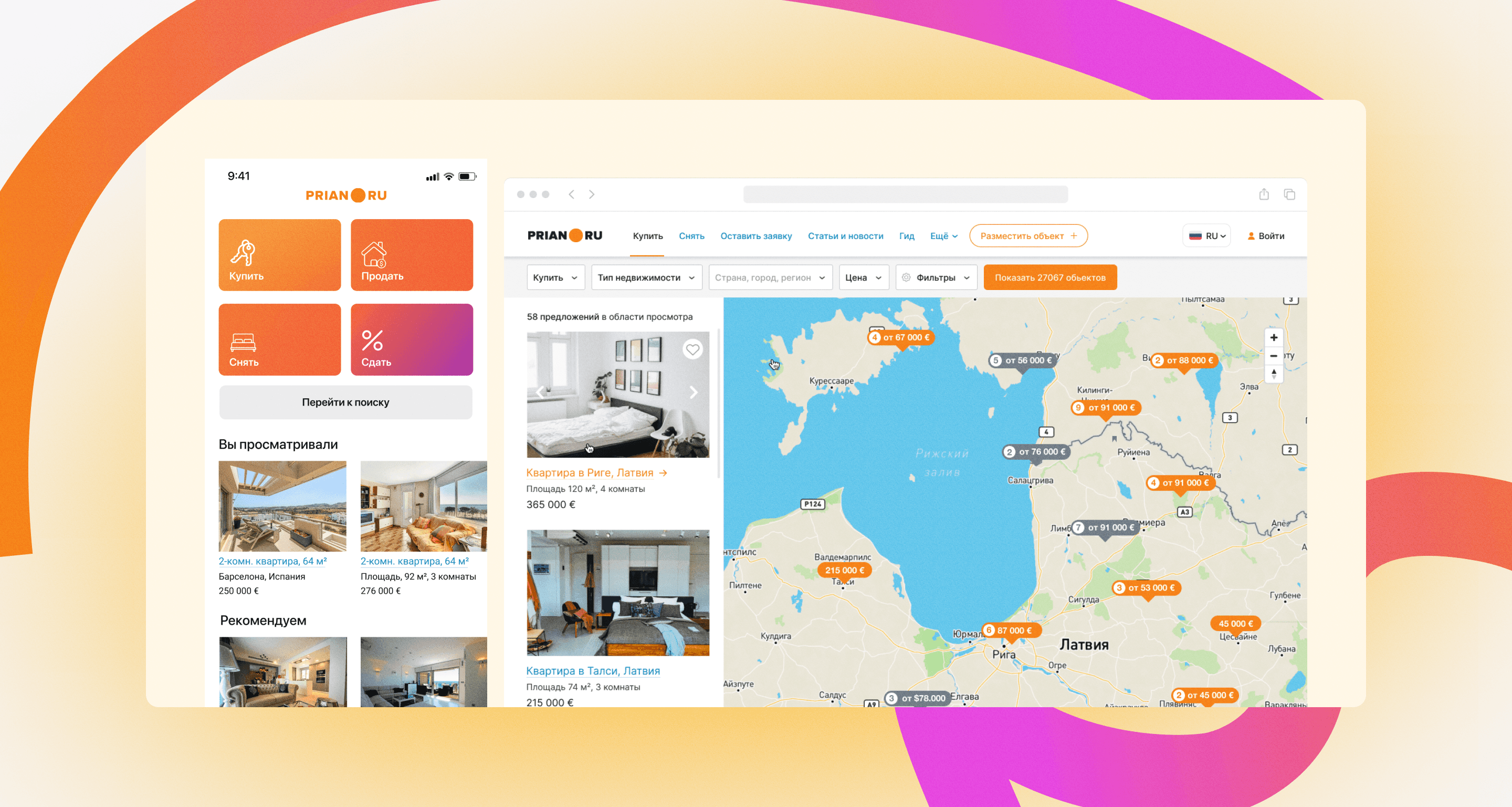
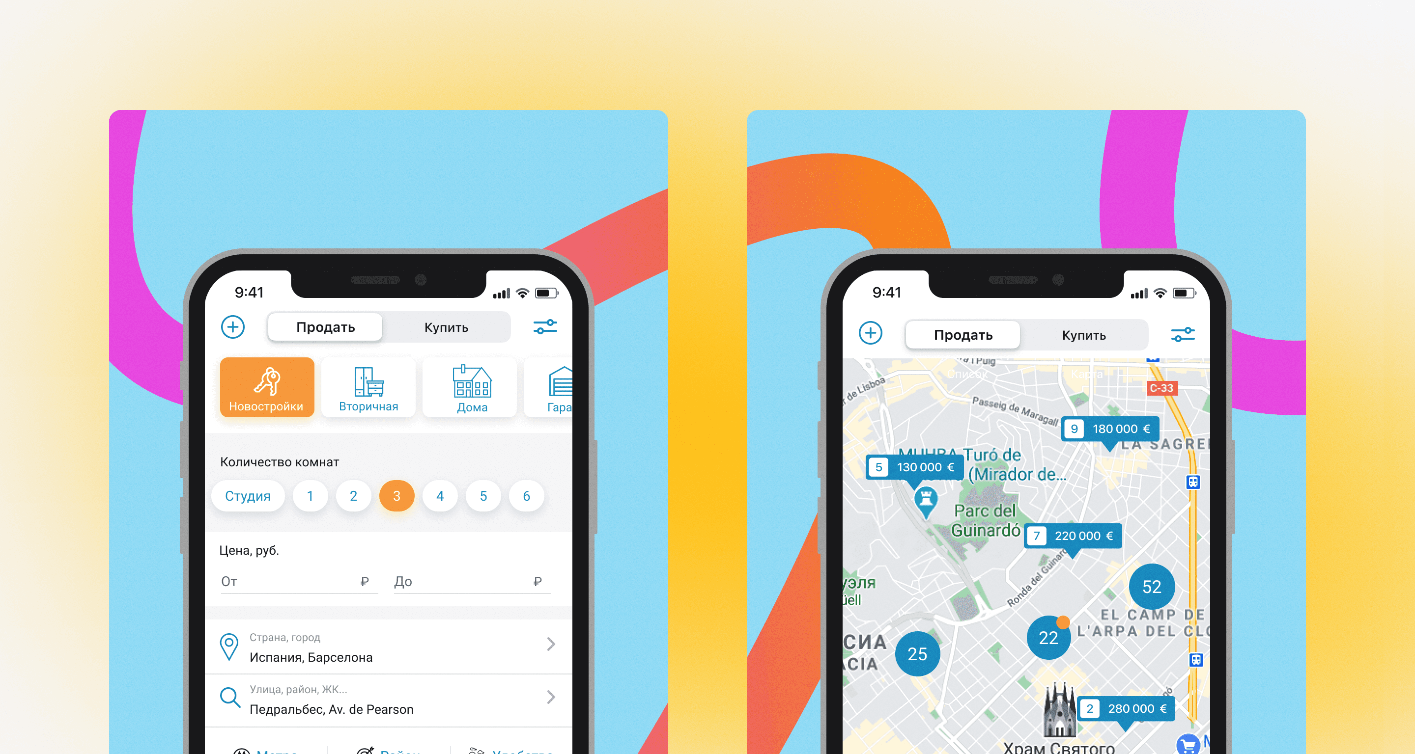
First of all, the site had to be redesigned. We created a simple and intuitive interface, determined how the site could be improved and how this would help the business. For example: An interactive map with filters was created on the search page. Now the client can visually see the places where he can buy real estate with suitable conditions.
Process of creation
We drew several conceptual mockups and sent them to the client. After the client approved them, we moved on to writing out a plan, creating a backlog, and working in sprints. I made mockups in Figma, created components and a design system.
Upon completion of the MVP, we gave the mockups to the developers. We immediately connected Google Analytic and Yandex Metrica to conduct A/B testing. We saw a positive increase in the indicators being studied. We continued to finish drawing the pages and conduct testing.
Outcome
After creating an interactive map with filters, the number of requests from the site increased by 24.3%. Upon completion of the project, the overall user reach increased by 26%, and requests by 7.6%.


